# Chart types
Making your data impactful is the first thing you need to consider when compiling your Dashboard. That is why you need to know how to transform data into proper and efficient visualization. Different charts embody different purposes, and tell different stories, therefore, understanding each type of chart definitely does wonders for your Dashboard creation.
Dataflake highly customizable visualizations help you to ease your work with advanced styling options. But first, in this article, let's learn about Chart Types in Dataflake: Bar Chart, Line Chart, Mixed Chart, Card Chart, Table Chart, Bubble Chart, Horizontal Chart, Scatter chart, Sankey Diagram, Map Chart
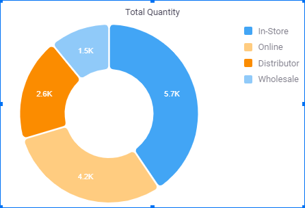
### Pie chart
Pie chart is used to illustrate the share of total. It presents well with simple proportions such as one-half, one-third, or one-quarter. Pie charts do not show changes over time such as bar and line charts.
### Bar Chart
Bar chart is to describe the changes in a given period of time or to compare the difference between categories.

### Stacked Bar chart
Stacked bar charts show totals and their shares, so we can see the comparison between categories in a given period of time.

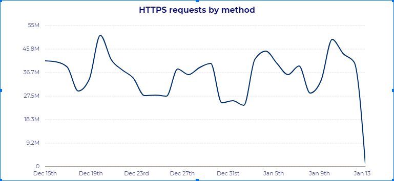
### Line chart
Line chart is to illustrate the changes overtime for one or more than two categories.
### Mixed Chart
Mixed chart is the combination of different types of charts. It is used to visualize the differences between different sets of data.

### Card Chart
Data card is to illustrate the overview of dashboards.

### Table Chart
Table arranges data in rows and columns, which shows detailed and comprehensive data.

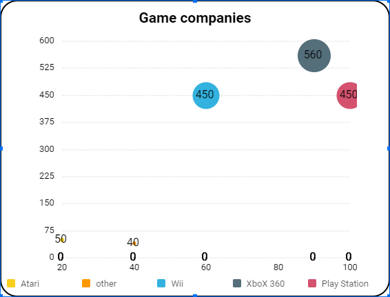
### Bubble Chart
Bubble chart is much like a scatter chart, but a third column is added to show relationships amongst 3 numeric variables. The size of bubble illustrates the data points
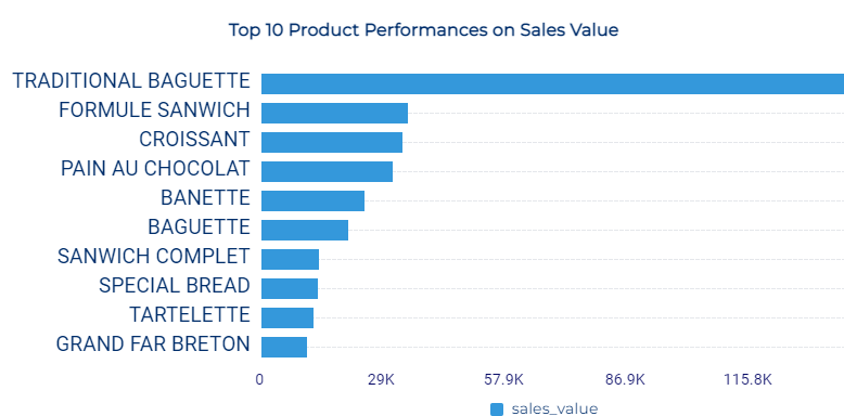
### Horizontal Chart
Horizontal Chart is a bar graph that draws horizontally. The data categories are presented on the vertical axis. The data values are on the horizontal axis. It is great to use in case the name of categories is long
### Scatter chart
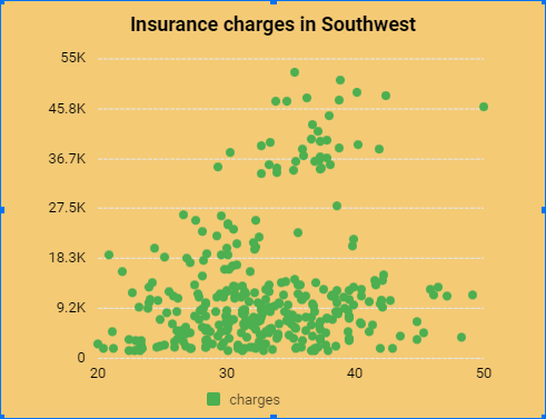
As known as scatter plot, scatter chart displays the relationship between two variables, helping to know a relationship or trend.
### Sankey Diagram
Sankey Diagram is used to illustrate a flow from several entities (aka nodes) to another. Several entities are displayed in rectangles or text. The connections (aka links) are displayed by arrow. The wider the arrow, the more important the flow amount.\
Sankey Diagram is for mapping particular kinds of domains, for example, flow of electrical energy from source to destination.

### Map Chart
Map chart is to represent geographical data. It is to show data distributed across a particular region.
When creating map chart in Dataflake, you must add the[ 2-digit country codes](https://www.iban.com/country-codes) or [3-digit country codes](https://www.iban.com/country-codes) in your data to show on map chart
