
Loading...
Loading...
Loading...
Loading...
Loading...
Loading...
Loading...
Loading...
Loading...
Loading...
Loading...
Loading...
Loading...
Loading...
Loading...
Loading...
Loading...
Loading...
Loading...
Loading...
Loading...
Loading...
Loading...
Loading...
Loading...
Loading...
Loading...
Loading...
Loading...
Loading...
Loading...
Loading...
Loading...
Loading...
Loading...
Loading...
Loading...
Loading...
Loading...
Loading...
Loading...
Loading...
Loading...
Loading...
Loading...
Loading...
Loading...
Loading...
Loading...
Loading...
Loading...
Loading...
Loading...
Frequently asked questions
We are currenly supporting puopular Data Sources including: PostgreSQL, ClickHouse, BigQuery, MySQL, Microsoft SQL Server, Flat files
Dataflake doesn’t store any of our your data. Dataflake will send the query to your database server, take the result and send directly to viewer.
However, in case you use cache, Dataflake will store the query result in Dataflake based on the cache time. This will help us display the dashboard faster for viewer, and reduce the load for your database server.
Dataflake sends the query directly to your database and no more than that, so the database user just needs the SELECT (Read) permission on tables used in the SQL. We always recommend giving enough permissions to your user to keep your database safer from cyber attacks
Dataflake is designed for Data Analysts from Small and Medium-Sized Businesses (SMBs) and Startups who are obsessed to tell better data story easily with highly customizable data visualization, and sharing, embedding analytics on websites or applications quickly and securely.
Dataflake aim to bring our users with seamless experience with high security and low cost so that you can empower your data visualizations without constraints.
Welcome to Dataflake! Here, you'll find relevant articles help you on a specific feature or quick tutorials, making the most of our powerful data visualization tool.
Dataflake is a data visualization tool to help data analysts from SMBs and startups who are obsessed to tell better data story easily and quickly with our intuitive data visualization experience without design, sharing, embedding and cost constraints.
Highly Customizable Data visualization
Creating interactive dashboards has never been easier by easy-to-use features and advanced styling options. Visualize charts and share actionable insights to stakeholders easily.
Configure sending dashboard via email easily with many advanced options. Set up time, subject and description to deliver your Dashboard to certain recipients. Configure your dashboard delivery to repeat daily, weekly, monthly, or even create a custom schedule.
Shared/ Embedded Analytics
Share or embed yoru dashboard/ analytics quickly and securely with advanced embedding configuration.
Manage queries in a single page (Coming soon)
Edit your queries, communicate and add reviews with your teammates to track the health of queries. Also, quickly see all query changes to get work done faster. All is in just one place.
If you have any questions or encounter issues, our support team is here for you. Reach out to us at [email protected]
Upcoming features Dataflake Blog Beta Program
Dataflake supports automatically sharing your Dashboard with your colleagues via email based on your condition setting, what we call as Email Delivery. Configure recipients, title, body of email like you send normal email. Set starting time, ending time and repetition so that your report will be automatically sent to the right member.
Another way of sharing your Dashboard is embedding dashboards to websites, applications or portals. Setting password, sealing and other authentication to ensure the right people are able to access the right Dashboards


Bar charts are useful in various situations, and they are particularly effective when you want to display and compare the values of different categories or groups.
Read this section to learn about how to create a chart here
Read this section to learn about how to use quick styling toolbar
Read this section to learn about styling chart with many advanced options here
A line chart is a type of graph that displays data points connected by straight line segments. It is commonly used to represent and visualize trends in data over a continuous interval or time span.
Read this section to learn about how to create a chart here
Read this section to learn about how to use quick styling toolbar
Read this section to learn about styling chart with many advanced options here
Card chart is a simple and concise visualization that displays a single, specific data point or metric. It is often presented in the form of a card or a small panel and is designed to provide a quick and easily digestible overview of a critical piece of information.
Read this section to learn about how to create a chart here
Read this section to learn about how to use quick styling toolbar
Read this section to learn about styling chart with many advanced options here
A scatter chart, also known as a scatter plot, is a two-dimensional graphical representation of a set of data points. Each data point in a scatter chart is represented by a marker (such as a dot) that is placed on the chart based on its values for two variables - one plotted along the horizontal axis (X-axis) and the other along the vertical axis (Y-axis).
Read this section to learn about how to create a chart here
Read this section to learn about how to use quick styling toolbar
Read this section to learn about styling chart with many advanced options here
You can move a chart from the current page to another page within a dashboard. Follow steps below:
Select the graph/chart and click on the right mouse
Choose move to pages and choose the page that you want to move the chart to
The chart will be moved to the new page
Universally create and edit chart labels
Click icon in the top right of the Dashboard
Column name: enter the field you’d like to change the name for the label
Label: enter the name you’d like to use for the field instead of the original field name
Click Add to add the new label
To make update to a field for a single chart, you can edit fields individually for each single chart. You can delete by clicking icon
In this page, we'll show you how to add a BigQuery source to Dataflake
Steps to connect BigQuery source to Dataflake is like connecting PostgreSQL to Dataflake. Read this to learn more
From the top navigation bar click on the icon.
Choose the Connection strings tab.
Click the Add button.
Enter the Name of your connection.
Select BigQuery from the Connection type.
Enter your connection string .
Click Next then Click the Complete button to establish your Connection.
In this page, we'll show you how to add a Microsoft SQL Server to Dataflake
Steps to connect Microsoft SQL Server source to Dataflake is like connecting PostgreSQL to Dataflake. Read this to learn more
From the top navigation bar click on the icon.
Choose the Connection strings tab.
Click the Add button.
Enter the Name of your connection.
Select Microsoft SQL Server from the Connection type.
Enter your connection string.
Server: domain, port, for example: 127.0.0.1,1433
Database: name of your database
User: username of the Database you want to connect
Password: password of the Database you want to connect
Click Next then Click the Complete button to establish your Connection.
In this page, we'll show you how to import a flat file into Dataflake
Currently, we do not support import flat files (csv, tsv format) directly into Dataflake.
However, if you have your databases which Dataflake support to connect, you can import flat files (csv, tsv or custom format) to them, then you can continue executing to connect your database to Dataflake.
To import your flat files into your database:
From the top navigation bar, click on the icon.
Choose the Connection strings tab.
Select the data source that you want to import your flat file in. Make sure that you already connect the data source to Dataflake
Click to import your flat file to the data source
Browse the file you want to add.
Select the type of file.
Name your Table.
Check this option if you want to consider the first row as the Header.
Click Next
Configure Data types for each column.
You can rename columns
Click Import
If you don't have your SQL database but want to explore Dataflake. No worries! We have curated, public Dataset for you
From the top navigation bar click on the icon.
Choose the Connection strings tab.
Click the Add button.
Click Use public dataset to connect to our public dataset
You can easily edit Data Sources in just a few steps.
Select data sources icon
Select Connection Strings. Then you will see your connection
Click the edit icon on the right
You can edit the name, connection type and database.
Like edit a data source, you just need to change the name of your data source, then click Next to save the renamed data source.
Select data sources icon
Select Connection Strings
On the right, click on Delete button
Confirm the delete by clicking yes
When you successfully connect to a database, you begin create query by writing SQL. Follow these instructions to add the query successfully!
To add a query:
Choose Queries tab
Click Add button to add a query
Choose the connection
Fill in the query name.
You can choose cache time. Cache time help us display the dashboard faster for viewer, and reduce the load for your database server.
Write your SQL in the query box. You can view Schema and Table to help you while you are executing your query
After completing these steps, select Next to finish the process
That’s done, you already add a query to Dataflake!
To edit a query:
Select Queries tab then we can see all the queries with edit buttons at the right
Selecting Edit button
We can edit data source, the query, its name, cache time, and other information
Click Next to successfully edit the query
To delete a query
Select delete button
Select yes to delete your query
Follow steps below to create your Chart.
Click icon in the left menu bar and choose your desired chart you want to create
Click to add the chart on the canvas
On the right panel, choose connection and choose your created query
Move to the Data tab, you can see the available fields, which are from your created query
Drag and drop columns in availables field to create your Chart
Finalize the charts by adding title, choosing colors and style the graph
If you haven't written your query before you add a chart, you can add a query and chart simultaneously
Click icon in the left menu bar and choose your desired chart you want to create
Click to add the chart on the canvas
On the right panel, choose connection and write SQL on the query box, you can view the Schema and Table
Name your query after writing
Choose Cache time and Tags if you want
Move to the Data tab, you can see the available fields, which are from your created query
Drag and drop columns in availables field to create your Chart
Finalize the charts by adding title, choosing colors and style the graph
Pie charts are useful in certain situations when you want to represent parts of a whole and emphasize the proportion of each component relative to the entire set.
Read this section to learn about how to create a chart
Read to learn about how to use quick styling toolbar
Read this section to learn about styling chart with many advanced options
A horizontal bar chart is a variation of the traditional bar chart where the bars are plotted horizontally instead of vertically. In a horizontal bar chart, the categories or groups are displayed along the vertical axis, while the numerical values are represented by the length of the bars along the horizontal axis.
Read this section to learn about how to create a chart
Read to learn about how to use quick styling toolbar
Read this section to learn about styling chart with many advanced options
A mixed chart, also known as a combination chart, combines two or more different types of charts in a single visual representation. This approach allows you to present diverse sets of data and relationships in a more comprehensive manner.
Read this section to learn about how to create a chart
Read to learn about how to use quick styling toolbar
Read this section to learn about styling chart with many advanced options
A bubble chart is a type of scatter plot in which data points are represented as bubbles. Each bubble typically has three dimensions: the horizontal position (X-axis), the vertical position (Y-axis), and the size of the bubble (diameter or area). The third dimension (size) is used to represent a quantitative value associated with each data point.
Read this section to learn about how to create a bubble
Read to learn about how to use quick styling toolbar
Read this section to learn about styling chart with many advanced options
A scatter chart, also known as a scatter plot, is a two-dimensional graphical representation of a set of data points. Each data point in a scatter chart is represented by a marker (such as a dot) that is placed on the chart based on its values for two variables - one plotted along the horizontal axis (X-axis) and the other along the vertical axis (Y-axis).
Read this section to learn about how to create a chart
Read to learn about how to use quick styling toolbar
Read this section to learn about styling chart with many advanced options
A map chart, also known as a geographical map or choropleth map, is a type of chart that visualizes data based on geographic locations. It uses color-coded or shaded regions to represent values of a variable across different geographical areas.
Read this section to learn about how to create a chart
Read to learn about how to use quick styling toolbar
Read this section to learn about styling chart with many advanced options
To delete a Chart, you can:
Select the graph and click on the right mouse
Select Delete
Confirm delete by selecting Yes
Another quick way is:
Click the graph you want to delete
Press Delete key on the keyboard
Confirm delete by selecting Yes
To duplicate a Chart
Select the graph and click on the right mouse
Select duplicate element
From the landing page, click to the New Dashboard button in the upper left side.
Then name the dashboard in the box and click Create
You’ll be directed to the Dashboard Editor
When you access Dataflake, you can see many Dashboard templates with different purposes so that you can create a Dashboard from the template and start to customize it.
Hover over the mouse to the template you want to choose and click Use template button
Name your Dashboard, then you will have the Dashboard like this
Begin customizing the Dashboard by modifying Connection string, query, chart styles and other elements if you wish
Dashboard template is the great option for you to quickly create a Dashboard without thinking too much on the styles and color. However, you can easily change them to meet your needs with customizable Dataflake styling options
Universally assign color to a legend
Hover on the top right of the Dashboard editor to see all Dashboard Management options
Click to set a color for the legend you want
Column name: Enter the field you want to set color for the legend
Click on icon to create the new legend color
To make update to a field for a single chart, you can edit fields individually for each single chart. You can delete by clicking icon
In this page, we'll show you how to add a MySQL source to Dataflake.
Steps to connect MySQL source to Dataflake is like connecting PostgreSQL to Dataflake. Read this to learn more
To connect to MySQL, from the top navigation bar click on the icon.
Choose the Connection strings tab.
Click the Add button.
Enter the Name of your connection.
Select MySQL from the Connection type.
Enter your connection string.
Hostname: where your database is hosted
Port: add port name
Database: name of your database
User: username of the Database you want to connect
Password: password of the Database you wish to connect
Click Next then Click the Complete button to establish your Connection.
In this page, we'll show you how to add a PostgreSQL source to Dataflake.
From the top navigation bar click on the icon.
Choose the Connection strings tab.
Click the Add button.
Enter the Name of your connection.
Select PostgreSQL from the Connection type.
Enter your connection string.
Hostname: where your database is hosted
Port:
The port the database server uses
For example, the default port number for PostgreSQL is 5432
Database: name of your database
User: username of the Database you want to connect
Password: password of the Database you wish to connect
Click Next then Click the Complete button to establish your Connection.
When you want to stop delivering Dashboard via email, you just need a few clicks
Open the dashboard you want to stop the email delivery schedule in view mode. Make sure that you must be an owner or editor of this dashboard.
In the upper right, click Share
Click Email delivery to go to the delivery schedule settings.
At the bottom of the popup, click Stop schedule
The dashboard then will not be sent to the email that you enter before
You can embed it into any other website that supports iframes, making it easy to share your data story as widely as possible.
Any website or app that supports the HTML iframe tag can be used to incorporate an embed report.
Dataflake automatically generates the iframe code, which contains a link to your report. There is no need to know HTML.
Anyone who visits your page can access the embedded report according to the share configuration you have set up.
Users viewing reports are under viewing only mode.
Filters and date range controls work as they should in embedded reports. Due to the lack of a navigation bar, users are unable to edit, copy, or distribute the report.
The data in display cannot be refreshed by viewers. Data only refreshes following the cache settings.
Set up a new share configuration.
See this section to learn how to set up a new share configuration
Save the new share configuration
Go to Share demo section
Select Embed in the Share type field
Enter seal params value if any
Change the width and height of the report to be embedded to your preference
Copy paste the iframe to your site


There are two ways that allow you to copy a Chart
You can use the shortcut
In the current page, select graph/chart.
Use Ctrl C (Copy) (use Command C if you use Macbook). Use Ctrl V (Paste) (use Command V if you use Macbook).
The copied chart will overlap with the previous chart.
Let’s drag a copied chart to another space on the canvas.
Or you can use copy element
Select the graph/chart and click on the right mouse
Choose copy element
Press Ctrl V / command V
You can use a shortcut
In the current page, select graph/chart
Use Ctrl C (Copy) (use Command C if you use Macbook)
Move to your desired page
Use Ctrl V (Paste) (use Command V if you use Macbook)
Or you can use copy to pages
Select the graph/chart and click on the right mouse
Choose copy to pages and choose the page that you want to paste a chart
The chart will be copied to the new page
You can include metrics that compare the overall value of a column to each row of your data.
In Columns section, click the pen icon
Click on the down arrow in the Comparison calculation field to select the type of comparison calculation you want to use
Percent:total - the current row's value divided by the total for that field.
Percent:max - the current row's value divided by the maximum value for that field.
Diff:total - the total for that field minus the current row's value.
Diff:max - the current row's value minus the maximum value for that field.
Percent-diff:total - the total for that field minus the current row's value divided by the total for that field.
Percent-diff:max - the current row's value minus the maximum value for that field divided by the total for that field.
Running computations produce a set of summary outcomes based on a set of data. They produce a result for each row of input, indicating how that row relates to the rest of the collection.
In Columns section, click the pen icon
Click on the down arrow in the Running calculation field to select the type of comparison calculation you want to use
Running sum: sum all value from current row up
Running min: minimum value from current row up
Running max: maximum value from current row up
Running count: current row value
Running average: average value from current row up
Running delta: value of current row - value of the row above
Analyze a specific range of a graph.
You can further analyze a chart in depth for a custom range to your needs.
Open in a view mode
On the chart you’d like to analyze, click the "box" icon
Drag select a specific range you’d like to analyze
To unselect: click outside the selected area to deselect the selection
To extend or reduce the range selection: drag right and left the icon to extend
Once the range has been selected, right click and select Zoom analysis this range
Ability to do the same analysis as single zoomed-in analysis but can compare between multiple charts.
On the chart you’d like to analyze, click the box icon
Drag select a specific range you’d like to analyze
To unselect: click outside the selected area to deselect the selection
To extend or reduce the range selection: drag right and left the icon to extend
Once the range has been selected, right click and select Zoom and compare this range
A zoom analysis popup will show up
Email Delivery helps to ease your repetitive work by automatically sending dashboards periodically based on your configuration.
Set conditions for scheduling periodic email dashboards which contain your dashboard. When the recipient receives and clicks the email, they will easily access the dashboard
This article will show you how to schedule an email delivery.
Open the Dashboard you want to schedule in view mode by clicking on the icon
In the upper right, click Share button
Click Schedule email delivery to begin scheduling a dashboard. The email delivery will be shown as below, to schedule the email, you can:
Enter the email address(s) of the recipients you want to send the dashboard to.
(Optional): Custom email subject and message.
Set the date and time you want to send the dashboard.
Set the delivery frequency. Choose Custom to create a personalized schedule according to your needs.
The dashboard then will be sent to the email that you enter before
Ensuring your data security is our top priority
Go to our Page
Asia-Pacific Data Center is located in Singapore
Western Europe Data Center is located in Germany
Dataflake does not store your data in our servers. You take full control over your data.
Dataflake sends the query directly to your database and no more than that, so the database user just needs the SELECT (Read) permission on tables used in the SQL. We always recommend giving enough permissions to your user to keep your database safer from cyber attacks
However, if you use cache, Dataflake will store the query result in Dataflake based on the cache time. This will help us display the dashboard faster for viewer, and reduce the load for your database server. When the cache time is expired, we no longer store your cache data in Dataflake servers.
We prioritize the utmost security for your data credentials throughout our data visualization process. From the moment you input your information, we employ SSL encryption to ensure a secure transfer, protecting your credentials from any potential unauthorized access. Once in our systems, your credentials are stored with the highest level of protection using public key cryptography, adding an extra layer of security to deter unauthorized access.
To minimize the risk of exposure, we adhere to a decrypt-only-when-necessary approach, ensuring that your credentials are only decrypted during specific query executions, thus avoiding any inadvertent leaks. Additionally, we take meticulous care to conceal your credentials in returned responses, providing an added layer of protection against accidental disclosure.
Go to Page
Go to Page


Learn types of charts that Dataflake is supporting!
Making your data impactful is the first thing you need to consider when compiling your Dashboard. That is why you need to know how to transform data into proper and efficient visualization. Different charts embody different purposes, and tell different stories, therefore, understanding each type of chart definitely does wonders for your Dashboard creation.
Dataflake highly customizable visualizations help you to ease your work with advanced styling options. But first, in this article, let's learn about Chart Types in Dataflake: Bar Chart, Line Chart, Mixed Chart, Card Chart, Table Chart, Bubble Chart, Horizontal Chart, Scatter chart, Sankey Diagram, Map Chart
Pie chart is used to illustrate the share of total. It presents well with simple proportions such as one-half, one-third, or one-quarter. Pie charts do not show changes over time such as bar and line charts.
Bar chart is to describe the changes in a given period of time or to compare the difference between categories.
Stacked bar charts show totals and their shares, so we can see the comparison between categories in a given period of time.
Line chart is to illustrate the changes overtime for one or more than two categories.
Mixed chart is the combination of different types of charts. It is used to visualize the differences between different sets of data.
Data card is to illustrate the overview of dashboards.
Table arranges data in rows and columns, which shows detailed and comprehensive data.
Bubble chart is much like a scatter chart, but a third column is added to show relationships amongst 3 numeric variables. The size of bubble illustrates the data points
Horizontal Chart is a bar graph that draws horizontally. The data categories are presented on the vertical axis. The data values are on the horizontal axis. It is great to use in case the name of categories is long
As known as scatter plot, scatter chart displays the relationship between two variables, helping to know a relationship or trend.
Sankey Diagram is used to illustrate a flow from several entities (aka nodes) to another. Several entities are displayed in rectangles or text. The connections (aka links) are displayed by arrow. The wider the arrow, the more important the flow amount. Sankey Diagram is for mapping particular kinds of domains, for example, flow of electrical energy from source to destination.
Map chart is to represent geographical data. It is to show data distributed across a particular region.
When creating map chart in Dataflake, you must add the 2-digit country codes or 3-digit country codes in your data to show on map chart
A table is a structured arrangement of data in rows and columns, where each intersection of a row and a column represents a specific data point. Tables are commonly used to organize and present data in a systematic and easy-to-read format.
Read this section to learn about how to create a here
Read this section to learn about how to use quick styling toolbar
Read this section to learn about styling chart with many advanced options here
Conditional format in Dataflake helps you highlight cells with a single color or multiple colors based on cells' values.
To Add conditional format, Click button on the quick styling toolbar
On the right panel, click Add condition format
Color style
Color style enables you to define the color for one row in one column or entire rows.
Select rows to format conditions
Select text color
Select cell's color
Format rules
If the cell's value is text, the conditions are as below:
Is
Is not
Is not empty
Is empty
Not containing
Contains
Ends with
Starts with
Match with (Regex)
If the cell's value is number, the conditions are as below:
Greater than
Greater than or equal
Less than
Less than or equal
Equal
Not equal
Format based on Choose the column value that you want to set format
Color & style Apply on: The column that you want to apply the color scale. Click on save to apply conditional formatting
Add titles, headings, and descriptions to your reports using text.
Select the icon from left toolbar.
Click on the canvas to place a box
Fill up the blanks with your text.
Select the text you want to use.
Change the font, size, color, alignment, overflow settings, border settings and other properties of the text in the toolbar underneath
Shape is used to visually separate data components, banners, and other graphical effects
Add Shape
Select the Shape icon from the toolbar to create a shape
Square
Triangle
Octagon
Oval / Circle
On the canvas, click to place a box where you want the shape to appear.
To adjust the shape’s look, use the shape Style toolbar underneath the shape
Shape tyle: change type of shape
Border style: include solid, dashed, dotted
Border color: remove or set colors for border
Shape color: choose colors for shape
Border
Border weight: set the lightness or thickness for the border.
Border radius: make rounded corners for shapes
Style and color of border
Images are used to add logos and pictures to your dashboard
Select the icon from the toolbar.
Choose the type of image you would like to upload. From URL link: type in the URL for a web-based image. Upload from your computer: choose an image from your hard drive and insert it into the canvas.
On the canvas, place a box where you want the image to display. The image’s size is determined by the size of the box.
Choose image size type.
Fit: The image is sized automatically to fit the frame (the image ratio will change depending on the frame size) Contain: The image is scaled to maintain its aspect ratio. Cover: The image is sized to maintain its aspect ratio while filling the frame
Style image with background color and border radius option
Display JSON response data from API
To add a JSON card to your reports,
Click the icon on the left toolbar.
Drag select an area you want to add the JSON card on the report.
URL: enter the full URL that you want to get data from. Note:
Because of security policies, your URL have to use https scheme.
Can include a param and allow user to change it in a filter.
Request method:
Get: retrieve data from a server at the specified resource.
Post: send data to a server to create/update a resource.
Request timeout: maximum time when trying to call API. When request time exceeds the maximum, we will show an error. Note: Leave it empty if you don’t want to set a maximum time.
Data path: path to a property of response JSON object (in case user don’t want to display whole response object)\
Note: leave it empty to display whole response
Example: When your api response with: { status: “success” data: { propertyA: “valuable data” } } And you want to show only “valuable data", you can config data path = data.propertyA
Choose the look for your JSON card
Click on tab “Style” in the right panel
Tooltip note: Note on the box, then you can see the question mark on the top right corner of filter
The rest styling options appear on the bottom toolbar
JSON Card style
Fill color: Fill color to the box
Border:
Weight: choose weight for the line of filter box
Radius: Choose to round filter box
Style: Style the line of filter box
Add box shadow: enable if you want to give the log element a more prominent look
In the left of toolbar, click on page icon to expand the full page list
At the bottom of the list, click icon to create a new page
Rename the page: click right away on the name and type to rename
Delete and Duplicate page
Click on the icon on the right of page. There are two options:
Delete: remove page from the dashboard
Copy: duplicate page
Follow steps as below:
Click and hold a page from the list
While click and hold a page, move the page up and down to reorder the page list
Unable on the right of the page name to hide page in view mode
Current page setting
Click the in the top right toolbar
Adjust width and height
Adust background color
Enable box shadow
Set time for auto refresh
Choose Free style canvas or Grid layout if you want
Hover on the top right of the Dashboard editor to see all Dashboard Management options
Click to set Header or Footer of the page
Header Show header: show/hide header H: add height for the header comparing to the furthest upper canvas Background color: Choose color for the header background
Footer Like header section, you can do the same to set the footer


You can create an URL to a Dataflake report that you may distribute, utilize in web sites, or do anything else with links. The dashboar’s current settings, such as styling, can be included in the URL.
Open Dashboard editor
In the top right corner of the Dashboard, click Share button to generate a new share configuration
Click Create a new share config button
Enter the following information to set up and customize the share configuration
Title: enter title for the share configuration
Role: the role of the user who has access to this share configuration
Authentication method: select whether users need to enter a password to access the report
Password: enter password if selected to authenticate with password
Pages: select pages to be shared for the share configuration
By default pages that are chosen to Hide in view mode are not selected to be shared. If you would like to still share those pages, please make sure that you select those pages
Default page: the very first page the user will see upon accessing the report
Create sealing for your report
Disable: no sealing for the report. Be careful when choosing Disable option because Your Dashboard is not protected when sharing external without sealing.
Quick:
Hash function
A hash function processes an input value, such as a string, and produces a consistent, fixed-length output. There are 3 hash functions: MD5, SHA-1, SHA-25
MD5 creates a 128-bit hash, whereas SHA1 creates a 160-bit hash (20 bytes). The SHA-256 algorithm returns hash value of 256-bits, or 64 hexadecimal digits
For example, Your string: to_date = 2023-12-12 (param value you want to seal using Hash function)
MD5 Hash: Df491bce52045a447683f82bf9936173
SHA1 Hash: 889e732df68ae54778977e2869a5210102dd9d46
Now, the URL link returns: https://app.dataflake.co/s/………?to_date = 2023-12-12&quick_seal=Df491bce52045a447683f82bf9936173
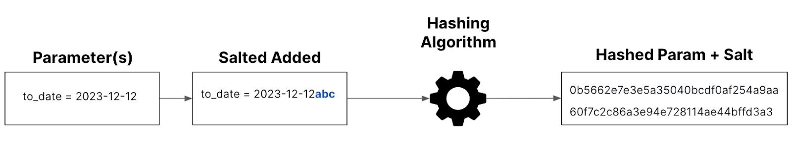
Salt
To the high level of protection, hash salting generators matter. Salt is a cryptographically strong random string applied to a password before hashing. This salt is stored alongside the hash, enhancing security by thwarting attempts to decipher the original plaintext unless both sources are accessible to an attacker.
The applied secret key formula: Secret key = hash (params + salt)
When you want to create a secret key, you just need to enter plain text to compute the hash and type “salt”. For instance,
3. Advanced: coming soon
Click Save to save the new share configuration
Click share configuration you created before
Go to Share demo section
Select URL in the Share type field
Enter seal params value if any
Copy paste the URL and share it with your teams
Or you can embed the Dashboard link into the application or website


Styling your chart easily and quickly with quick styling toolbar
When you style a box, it means that you style all components in your chart
Elements in Box include:
Text color
Background color
Boder (Weight, Radius, Border line, Border color)
Shadow
Style elements for Title
Font text
Font size
Text format (Bold, Italic)
Title color
You can click the header section or click “Header” in the toolbar
Below are some options you can see to style the header (name of column) in the table From the left to the right, let’s discover
Font family: Change the font of your header
Fontsize: Change the size of your header
Bold: Bold your header
Italic: Format your header with italic side
Text Color: Color your header
Fill color: Fill color to your header area
Text Alignment: Align your header to the left, central, right
A legend is an explanation of characters, symbols in chart. Like style title, there are some options you can do to style legend
Font text for legend
Font size
Legend text format (Bold, Italic)
Legend color
You can enable
Bar stacking
Set stacking percentage
Unit type: choose unit type for your label
Digital storage: B, KB, MB, GB, TB. For example: 1MB = 1024B
Digital storage 10 base: B, KB, MB, GB, TB. For example: 1MB = 1000B
Metric length: Mm, cm, dm, m, dam, hm, km
Percentage: %
Time: Microseconds, milliseconds, seconds, minutes, hours
Other
For data label, there are many choices you should style:
Enable data labels: labels will show on bar graph
Label position: Above, Center, Below
Label orientation: Vertical, Horizontal
Font family: Choose font family for the label
Font size: Choose font size for the label
Font format : Bold, Italic
Color: Color your label
Chart type: Pie chart and donut-pie chart
Donut style: Choose inner radius to select the thick of donut chart
Slice label: Allow to choose percentage or label
Unit:
Digital storage: B, KB, MB, GB, TB. For example: 1MB = 1024B
Digital storage 10 base: B, KB, MB, GB, TB. For example: 1MB = 1000B
Metric length: Mm, cm, dm, m, dam, hm, km
Percentage: %
Time: Microseconds, milliseconds, seconds, minutes, hours
Other
For data label, there are many choices you should style:
Enable data labels: labels will show on bar graph
Label position: Above, Center, Below
Label orientation: Vertical, Horizontal
Font family: Choose font family for the label
Font size: Choose font size for the label
Font format : Bold, Italic
Color: Color your label
Line style: Enable stacking line or/ and 100% stacking
For data label, there are many choices you should style:
Enable data labels: labels will show on bar graph
Label position: Above, Center, Below
Label orientation: Vertical, Horizontal
Font family: Choose font family for the label
Font size: Choose font size for the label
Font format : Bold, Italic
Color: Color your label
Horizontal bar chart is like bar chart, but it rotates to the horizontal style. You can style horizontal like style bar chart.
Note
Line style
Line weight: the visual lightness, darkness, or heaviness of a line within a drawing from 0 to 14
Curve: Smooth, Straight, Stepline
Area: toggle to enable
Bar style
Column width: Extremely narrow, narrow, Default, Wide
Data label: See style a bar chart
Y axis
Reverse: reverse y axis to the opposite
Show value: Show or hide y axis value
Mostly card chart are text and number, so, there are box and title options we can style
Click the header section or Click “Data” in the toolbar Below are some options you can see to style your Data
From the left to the right, let’s discover
Select Column: Choose column to style. You can choose all columns
Font: Change the font of your data
Fontsize: Change the size of your data
Bold: Bold your data
Italic: Format your data with italic side
Text Color: Color your data
Fill color: Fill color to your data area
Text alignment: Align your data to the left, central, right
Size: pull to choose the size of node
For data label, there are many choices you should style:
Enable data labels: labels will show on bar graph
Label position: Above, Center, Below
Label orientation: Vertical, Horizontal
Font family: Choose font family for the label
Font size: Choose font size for the label
Font format : Bold, Italic
Color: Color your label
Nodes
Aligment: Align nodes to the left, center, right or justify
Sort: Auto, Acsending, Descending, Input
Thickness: Adjust the thickness for nodes
Spacing: Identify the space beetween the source and the target
Border radius: Set for the nodes
Links
Enable gradient: enable to show gradient, unenable to unshow
Link contract: Adjust the size of link contract
Format
Unit: choose the unit for the value:
Digital storage: B, KB, MB, GB, TB. For example: 1MB = 1024B
Digital storage 10 base: B, KB, MB, GB, TB. For example: 1MB = 1000B
Metric length: Mm, cm, dm, m, dam, hm, km
Percentage: %
Time: Microseconds, milliseconds, seconds, minutes, hours
Other
For data label, there are many choices you should style:
Enable data labels: labels will show on bar graph
Label position: Above, Center, Below
Label orientation: Vertical, Horizontal
Font family: Choose font family for the label
Font size: Choose font size for the label
Font format : Bold, Italic
Color: Color your label
Color: Choose the range of color topresent in the map
Border: Choose to set the border weight for area border
Unit type:
Digital storage: B, KB, MB, GB, TB. For example: 1MB = 1024B
Digital storage 10 base: B, KB, MB, GB, TB. For example: 1MB = 1000B
Metric length: Mm, cm, dm, m, dam, hm, km
Percentage: %
Time: Microseconds, milliseconds, seconds, minutes, hours
Other: Choose the unit for the value
Show value: Click to show x axis, Hide to disappear x axis
X scale: scale the x axis
Datetime: show time series in x axis. You can custom the date time format in “x tooltip format” field
Category: show a dimension in x axis
Numeric: order by number
Reverse: change the data’s x axis to the opposite
Dimension position: Horizontal, Incline, Vertical
Show value: Click to show left axis, Hide to disappear left axis
Min/max value: Min y axis value & Max y axis value Min & max value can be a number or math which is used to set max or min value for y axis
max(a, b, c,...): to get max value
min(a, b, c,...): to get min value
Reverse: change the data’s y axis to the opposite
Show toolbar: You can see the toolbar shown on the right, click to download chart as file svg, png, csv
Hide toolbar: Toolbar will disappear in your chart
Toolbar Position: Position the toolbar within a chart
Date range filter allows you to filter your report data based on a date and time range.
Click on the icon on the left toolbar to show the list of available filters
Select Date range filter to begin adding this type of filter to the canvas
Drag select an area on the canvas to place the filter on the dashboard
In the right panel, fill out the following fields in Filter tab to customize the functionality of the filter
Label: enter the name you want to name the filter
Key: select the parameters you’d like to use for the filter
Default value: select the from and to date range for the date filter
Show time select: select when you’d like to show the filter for time in addition to the date range
Hide when exist on URL: You can show or hide filter when you share via URL
Search: Search option you want to appear by text in the box
Label font size: Choose the size for label
Data font size: Choose the size for Data
Line break between and input: Allow to break a line between label and data a. Tick box to enable b. Untick box to disable
Show description: Note on the box, then you can see the question mark on the top right corner of filter
Like style your chart, you can style your filter box by looking at the bottom toolbar below
From the left to the right:
Font: Choose font for your filter
Font size: Choose size for your filter
Format: Bold, Italic
Text color: Color the filter text
Fill color: Fill color to the filter box
Vertical alignment: align the filter to top, center, bottom
Border:
Weight: choose weight for the line of filter box
Radius: Choose to round filter box
Style: Style the line of filter box
Color: Color the line of filter box
Box alignment:
Align the content inside the filter box to the side you want to set
Box shadow: Tick box to enable box shadow Untick box to unable box shadow
Filter for matching text.
Click on the "filter" to show the list of available filters
Select “Text” to begin adding this type of filter to the report canvas
Drag select an area on the canvas to place the filter on the report
In the right panel, fill out the following fields in “Filter” tab to customize the functionality of the filter
Label: enter the name you want to name the filter
Key: select the parameters you’d like to use for the filter c. Hide when exist on URL: When enabled, this filter will be hidden when its param exists on the URL.
Ex: filter is using params @my_param
Case 1: url is https://app.dataflake.co/s/xxx/?my_param=value => Filter is hidden
Case 2: url is https://app.dataflake.co/s/xxx=> Filter is visible
Case 3: url is https://app.dataflake.co/s/xxx/?not_my_param=value => Filter is visible
Select input: if enabled, set settings for the following
Multiple select: enabled if you want to allow viewers to apply multiple filter options at once Default all options: set default to all when using options from a datasource
Enabled Disabled: will need to set “Default value” if disabled
Condition: set the condition to be check against the value input
Options source
Manual: input filter options by hand
Click “Add an option” to manually add an option
All added options are listed under “Options”
Data source: pull filter options from data through queries
Choose database connection you would like to pull options from
Choose a query from an already existing query
Click "+" icon to add a new query
To style the look of the filter, click on Style tab
Search: Search option you want to appear by text in the box
Label font size: Choose the size for label
Data font size: Choose the size for Data
Line break between and input: Allow to break a line between label and data
Tick box to enable
Untick box to disable
Show description: Note on the box, then you can see the question mark on the top right corner of filter
Like style your chart, you can style your filter box by looking at the bottom toolbar below:
From the left to the right:
Font: Choose font for your filter
Font size: Choose size for your filter
Format: Bold, Italic
Text color: Color the filter text
Fill color: Fill color to the filter box
Vertical alignment: align the filter to top, center, bottom
Border:
Weight: choose weight for the line of filter box
Radius: Choose to round filter box
Style: Style the line of filter box
Color: Color the line of filter box
Box alignment
Align the content inside the filter box to the side you want to set
Box shadow: Tick box to enable box shadow Untick box to unable box shadow
Use this filter if you would like to use something similar to “Date range” filter but with advanced customization options.
Click on theto show the list of available filters
Select Absolute time range to begin adding this type of filter to the report canvas
Drag select an area on the canvas to place the filter on the report
In the right panel, fill out the following fields in Filter tab to customize the functionality of the filter
Label: enter the name you want to name the filter
Key: select the parameters you’d like to use for the filter
Default value
a. Absolute time range: enter the custom days from now () for from and to you would like to set
b. Around fixed value: the day you would like to use as “now()”
c.Relative time range: select a relative time range from now, Ex: when select “last 5 minutes” query params will have values “now()” and “now() - 5 minutes”
To style the look of the filter, click on “Style” tab
Search: Search option you want to appear by text in the box
Label font size: Choose the size for label
Data font size: Choose the size for Data
Line break between and input: Allow to break a line between label and data Tick box to enable Untick box to disable
Description note: Note on the box, then you can see the question mark on the top right corner of filter
Like style your chart, you can style your filter box by looking at the bottom toolbar below:
From the left to the right:
Font: Choose font for your filter
Font size: Choose size for your filter
Format: Bold, Italic
Text color: Color the filter text
Fill color: Fill color to the filter box
Vertical alignment: align the filter to top, center, bottom
Border:
Weight: choose weight for the line of filter box
Radius: Choose to round filter box
Style: Style the line of filter box
Color: Color the line of filter box
Box alignment
Align the content inside the filter box to the side you want to set
Box shadow: Tick box to enable box shadow Untick box to unable box shadow


Display the max/ min/ average values on the chart
On the chart you’d like to show the max/ min/ average values right on the chart, go to Style tab on the right panel
Scroll down to section Max./ Min./ Average
Toggle ON the value you want to show on the chart
When enabled, the value will show on the bottom of the chart

No matter which journey you are on, you are playing around with Dataflake in order to make the final decision of purchase or you are on a free plan. We're sure that you need information so that you can easily analyze data with Dataflake, and without obstacles. This article will deliver you a specific and visionable guild, therefore, you can build your first Dashboard in a matter of minutes
After finishing creating your account with Dataflake, you have to create a workspace. A workspace is a place that gathers members involved in a project or campaign that shares all of your related dashboards present.
Within your workspace, you will quickly see the New Dashboard button. Just click this button and name your dashboard, then you will navigated to Dashboard Editor, where you are about to dive into your Dashboard creation
Dataflake allows you to connect to databases including: PostgreSQL, BigQuery, ClickhHouse, MySQL, Microsoft SQL Server, and Imported flat Files. Stay tuned, other databases will come soon to streamline your work.
All you need to do is choose your type of database and fill in required security credentials. Don’t forget to set the name for your database so that you can quickly search it while creating charts
You can read this section to learn more about how to connect to a data source
Once you have successfully connected a data source, it’s time that you wrote a query to gather and structure data you want from your database using SQL. With Dataflake, you can directly query in the right panel within your dashboard. It is to help you save your time instead of navigating different page
When you get your query results after retrieving from the database, you start with visualizing charts. Dataflake provides multiple types of charts to highlighted tell your story, so, you can select type of chart that fits your needs
Additionally, you can beautify your dashboard by adding other styling elements such as: image or shape.
Another thing to consider is customizing your visualizations to make your Dashboard attractive yet digestible so that you can captivate your audience. You can directly style your Chart title, Label, Legend, axis, etc in the toolbar. It is easy-to-use and time-saving
Make a great combination amongst visualizations, text, images, color, annotations, structure, so forth to turn into aesthetic and actionable dashboards. Make sure your audience can grasp your message that you want to deliver throughout your dashboard.


In this page, we'll show you how to add a Clickhouse source to Dataflake
Steps to connect ClickHouse source to Dataflake is like connecting PostgreSQL to Dataflake. Read this section to learn more
From the top navigation bar click on the icon.
Choose the Connection strings tab.
Click the Add button.
Enter the Name of your connection.
Select ClickHouse from the Connection type.
Enter your connection string.
Hostname: where your database is hosted
Port: default port number for ClickHouse is 8123
Database: name of your database
User: username of the Database you want to connect
Password: password of the Database you want to connect
Click Next then Click the Complete button to establish your Connection.
